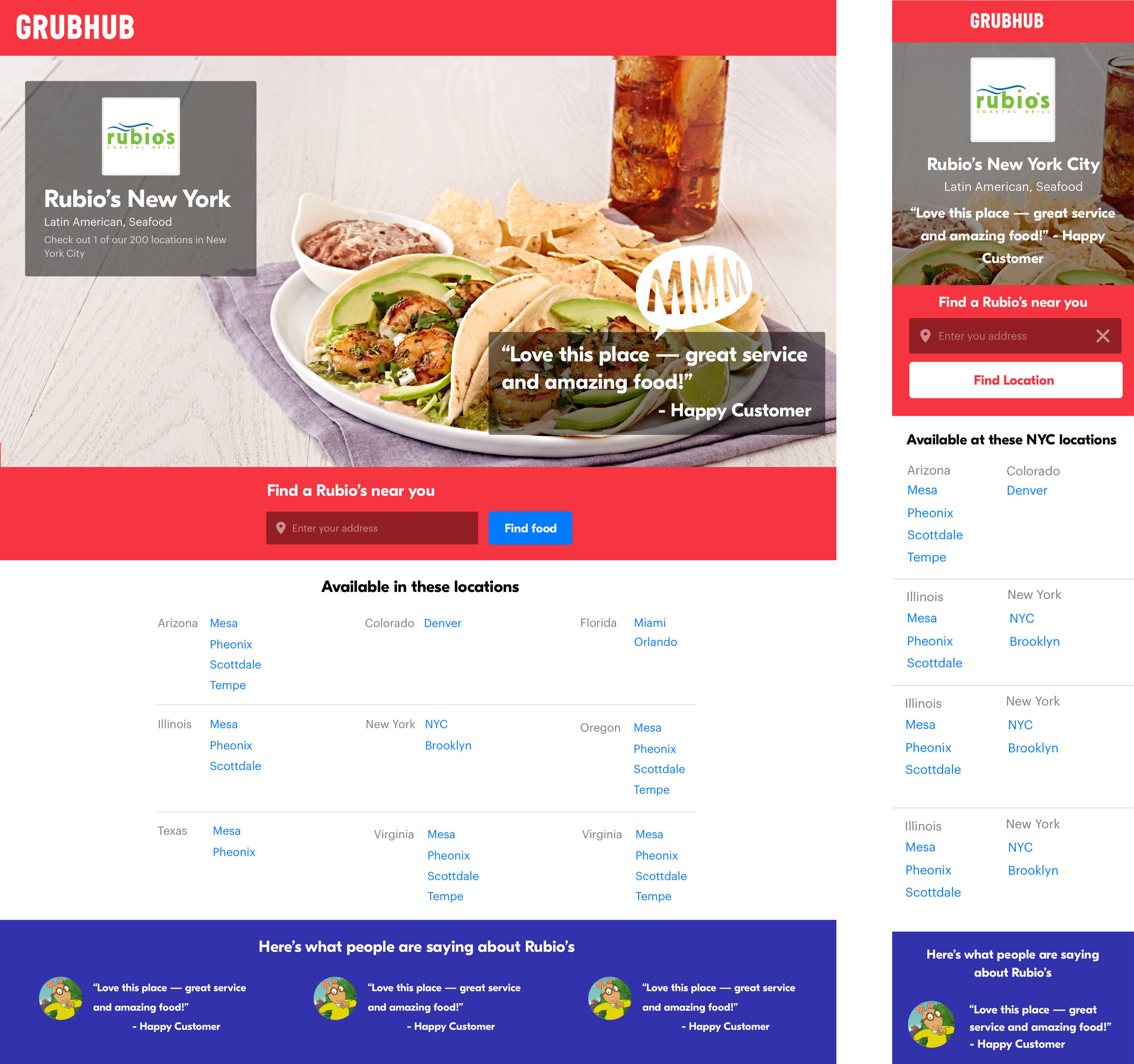
Chain Restaurant Search Experience
Making it easy for users to find and order from a specific chain restaurant location near them.
Background
The chain restaurants on Grubhub needed a unique search experience that would allow users to search all the locations for a specific chain nearby. Some examples include, Qdoba, Shakeshack, Subway, and Chop’t. I designed, prototyped, tested and worked with engineering to develop the experience.
Problem
Users needed a way to find a chain restaurant location nearest to them. By creating a search experience specific to each restaurant, a user could come straight from a search engine to find a location and bypass our regular search results.
Team
Myself (Designer)
Leah Olverd (Product Manager)
Engineering
Outcomes
Creating this search experience allowed the businesses to form more partnerships with larger chains and compete with other products such as Caviar, Postmates, and Uber Eats, which also delievered from these popular restaurants.
Designs
After a few iterations while sketching and reviewing with my team, I decided it made sense to make the map the focal point of the experience, to make it easy for users to spot their closest location. After we collected the diner's address they would be shown a split view of the locations listed out and pinned on the map. Once a user chooses the location they want to order from, they would be brought to Grubhub or Seamless to begin their order, and checkout.
Search Flow
The main goal was to create a simple search experience for our users to find a chain nearest to them. I wanted to direct users to the map view for an optimal experience, but after discussing with engineering, it was clear that we wouldn’t always know their location. We decided that we needed to add both a national and city level.
Once a user was brought to the map view, they would be able to see all of the locations nearest to them. From here, they would be brought to the menu page where they can complete their order.
Exploring a one page concept, Once entered their address the bottom list would populate the nearest restaurants. They could switch between a map and list view.
Similar concept combining the list and map view in a separate page.


